A jewellery shop,
taking its first
step online.
Tawisa is a family jewellery shop. In seven days I gave it a name in type, a colour of its own, a design system and every screen of its online store.
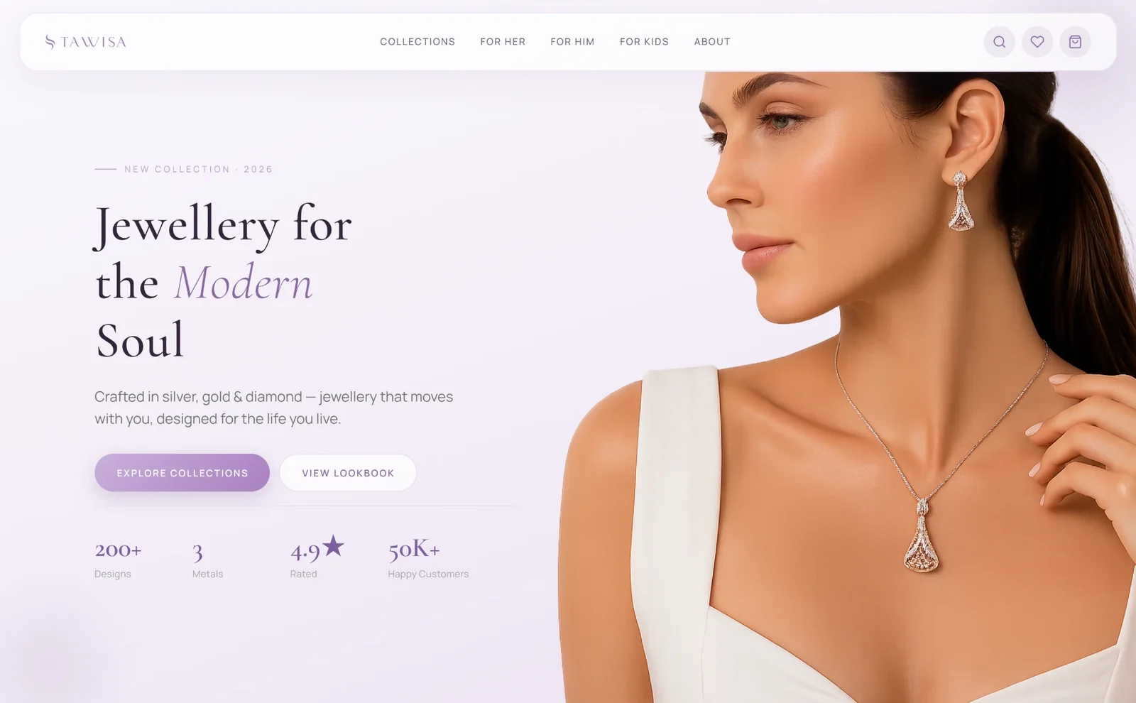
A store like the big ones.
Designed in a week.
Tawisa sells silver, gold and diamond jewellery from its own shop. The owners wanted to sell online too, and they pointed at the big Indian jewellery stores as the model: browse by who it’s for, filter by metal, pick a stone, pay online.
There was no brand to build on yet, only the shop’s name. So the job started with a logo and ended with a store a developer could build from.
- My role
- Brand, logo, design system and UI
- Client
- Tawisa
Freelance - Design time
- 7 days
Build in progress with a developer friend - Platform
- Web
Desktop and phone
Everything a first
store needs.
The brief was a starter store, kept small on purpose so it could launch. Small still meant a full shopping journey:
- A homepage, and landing pages for Her, Him and Kids
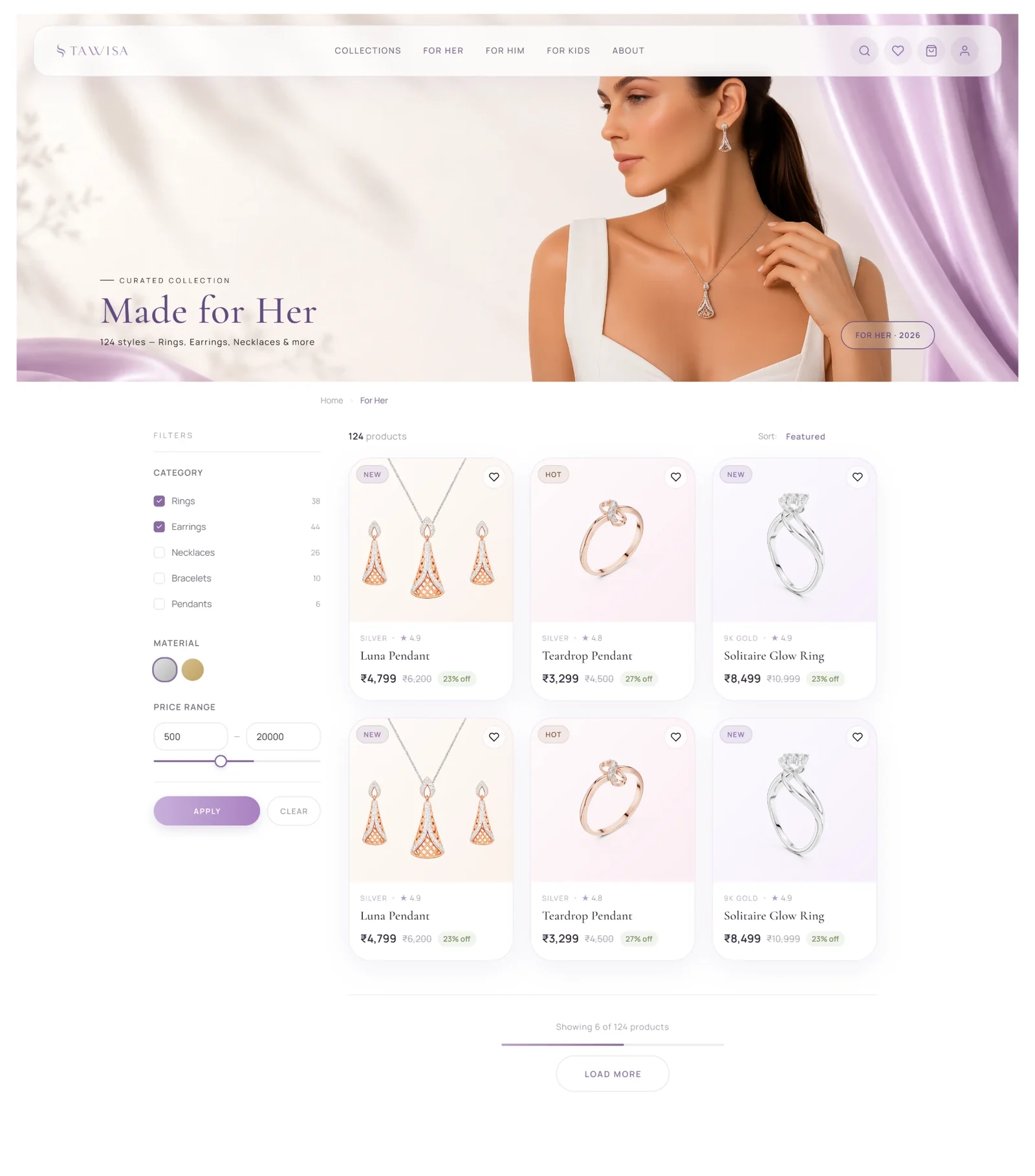
- A catalogue with filters for category, metal and price
- Product pages where you pick the metal, stone and colour
- Sign-in with a one-time code by phone or email, or with Google
- Wishlist, cart, and an account for profile, orders and addresses
Gold came first.
Then I looked around.
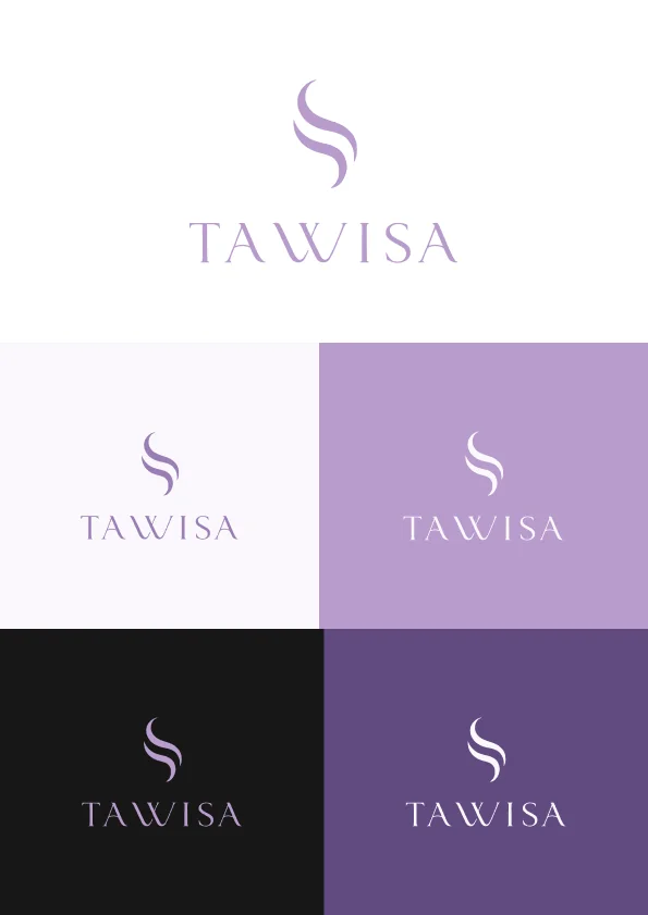
The logo is a flowing S mark above a widely spaced serif wordmark. It works on light and dark grounds and on its own as a symbol.
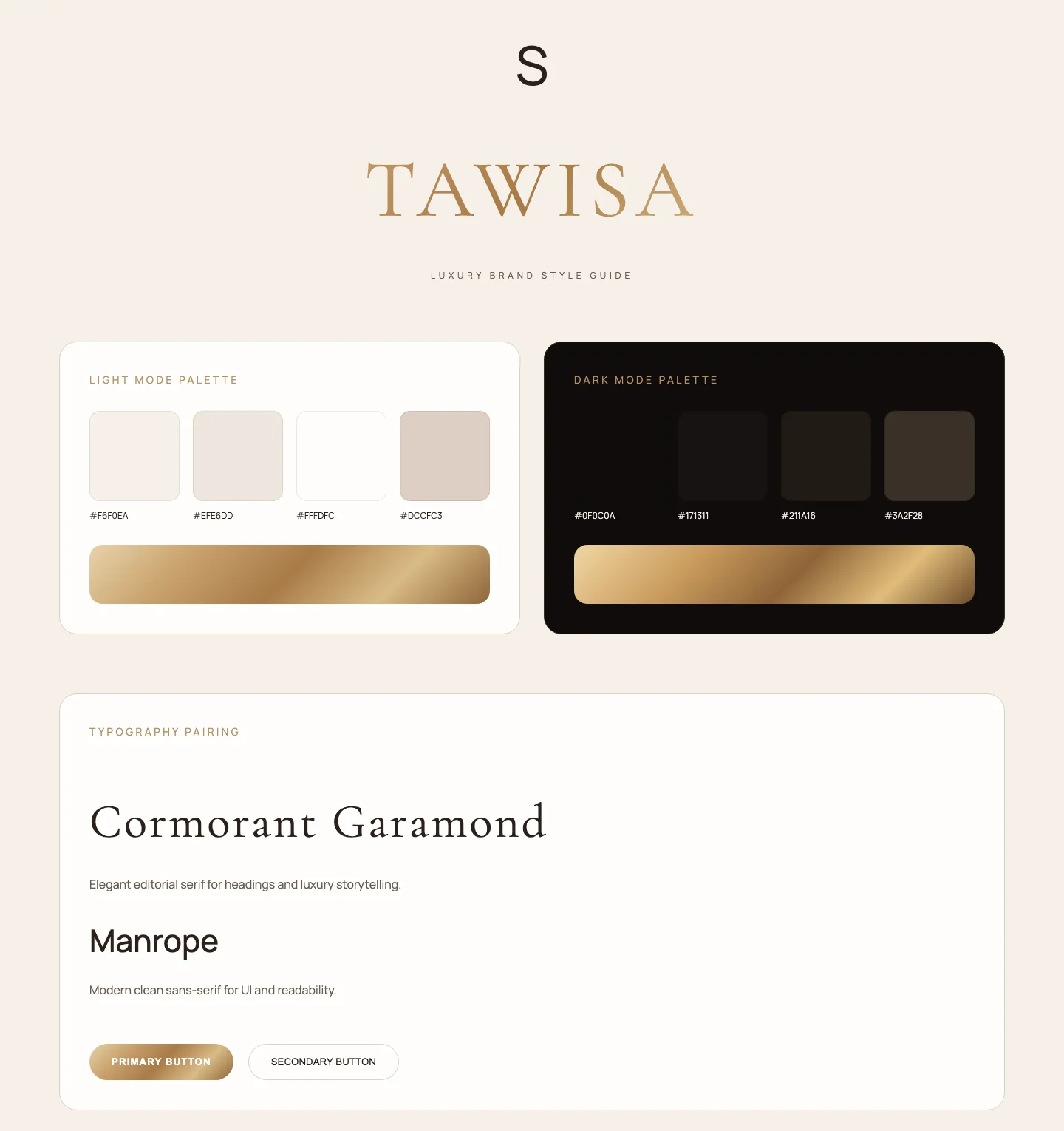
The first colour system was the obvious one: gold on warm cream, in light and dark modes. It looked right for jewellery, and that was the problem. Almost every jewellery store in India already looks like that.
Three directions.
One that stood out.
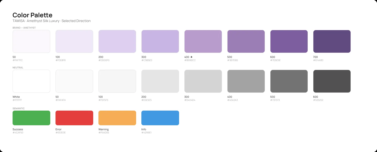
I kept the type pairing and tried three colour worlds on the same layout: champagne and rose-gold, blush pink, and amethyst.
Amethyst won. Nothing else in the market looked like it, it suited a shop whose buyers are mostly women without tipping into pink, and the client liked it.
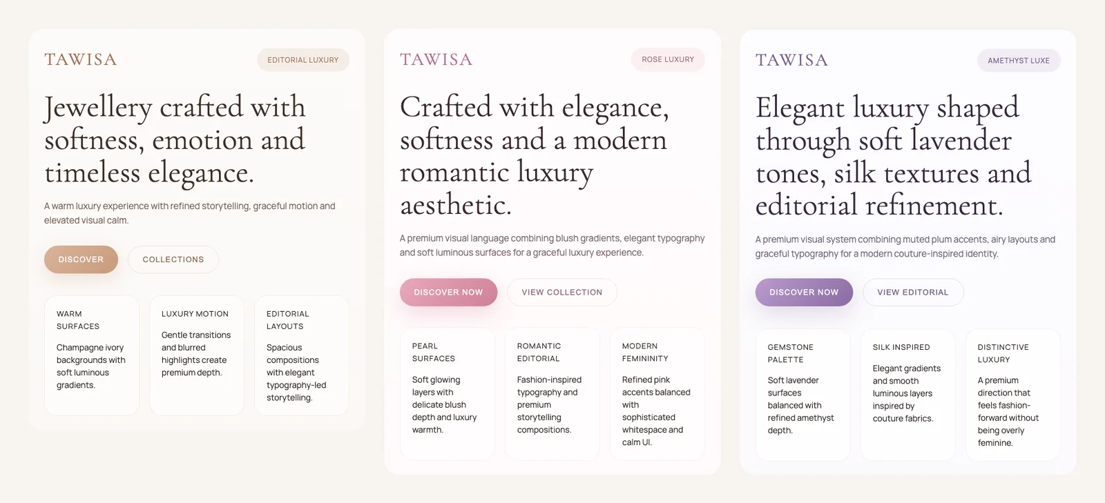
The direction, in one lineSoft lavender surfaces, plum accents and silk-like gradients: premium, fashion-forward, and not like any other jewellery store.
Built once,
used on every screen.
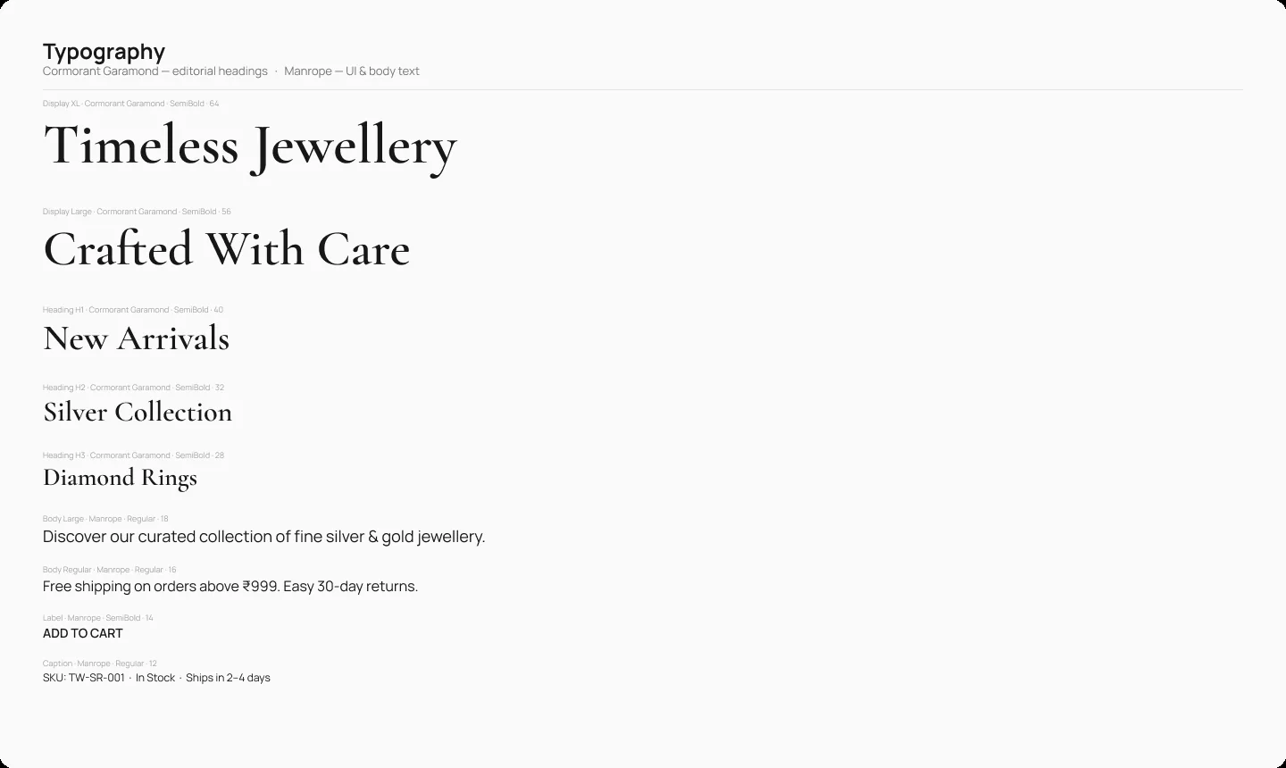
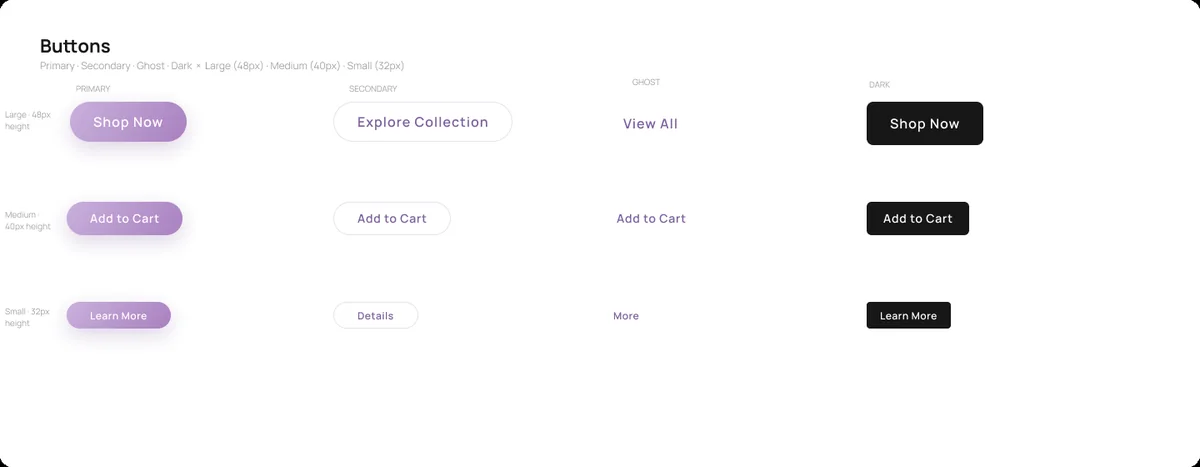
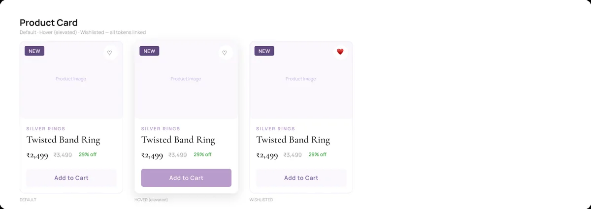
With a friend coding it, the Figma file had to answer questions before they were asked. So the system came before the screens: an eight-step amethyst scale, neutrals and status colours, Cormorant Garamond for headings and prices, and Manrope for everything you read or tap.
Tokens
A 4px spacing grid, seven corner radii from 2px to a full pill, and five shadows plus an amethyst glow.
22 text styles
Display to caption, with separate price styles so ₹ figures line up on cards, product pages and the cart.
Components
Buttons, inputs in five states, product cards, badges and the category pill row that scrolls on phones.
Browse by who
it’s for.
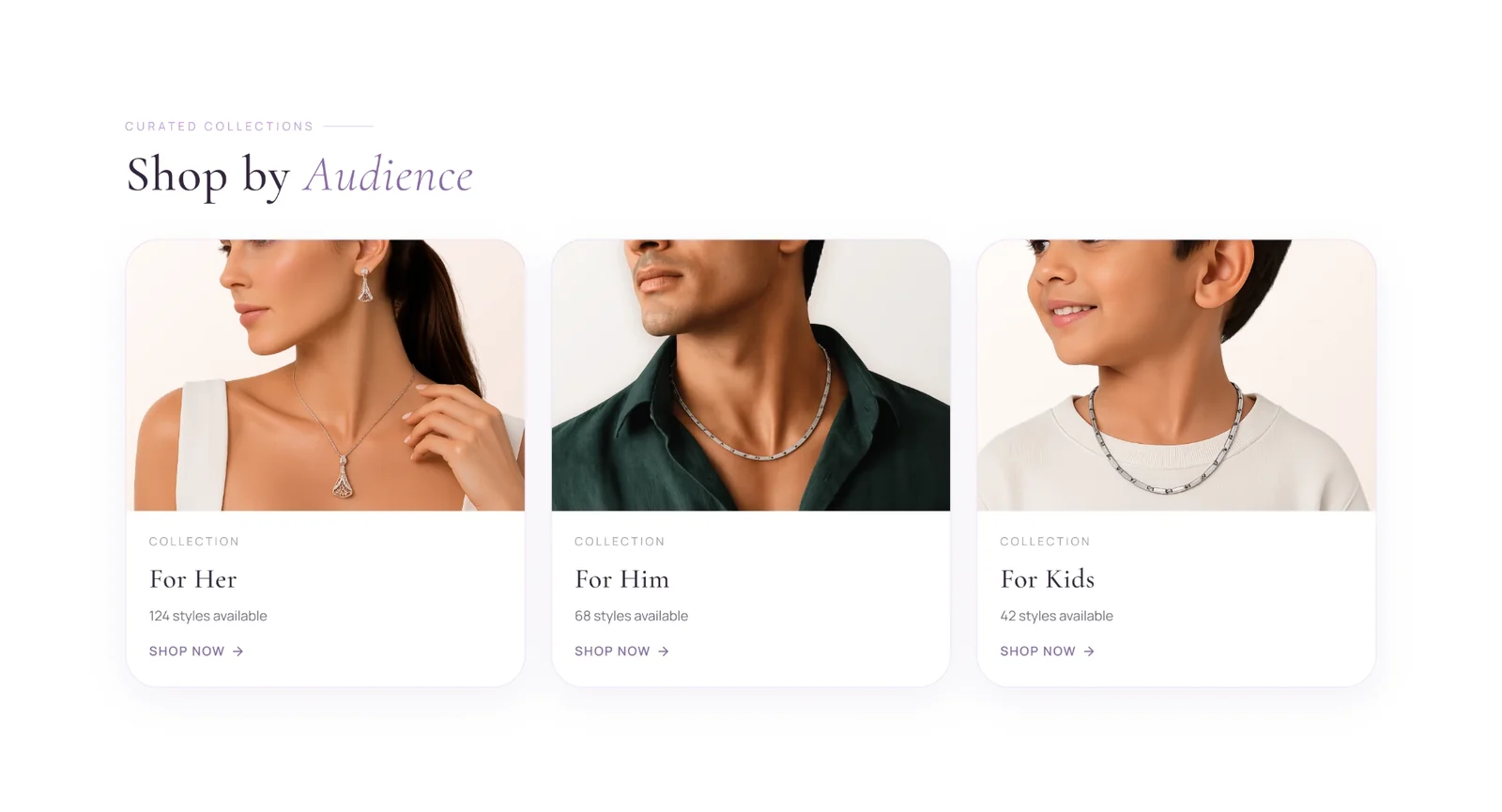
Most people shop for jewellery with a person in mind, so the homepage leads with For Her, For Him and For Kids, then a row of metal filters and the bestsellers.
Choose it.
Trust it.
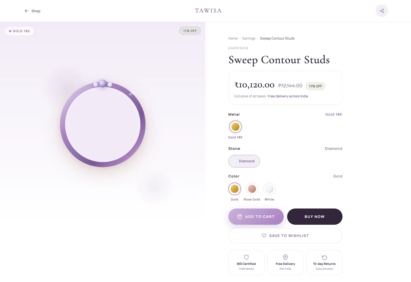
Jewellery is bought on detail. The product page lets you pick the metal, stone and colour, then answers the worries that stop people paying online: hallmarking, delivery and returns.
- Price with the original and the saving, and taxes included
- Metal, stone and colour as swatches, with the current choice named
- BIS Certified, Free Delivery and 15-day Returns, right under Buy Now
- Weight, carat and SKU in a details panel, then pieces to complete the look
Designed at 360px,
not squeezed into it.
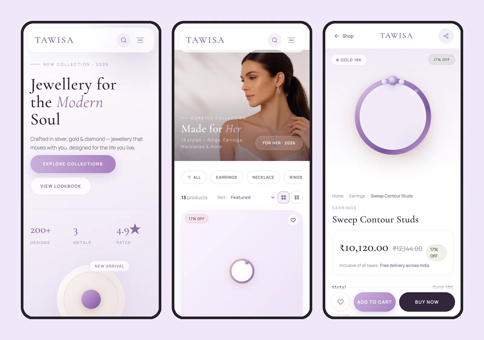
Every screen was drawn twice, at 1440px and at 360px. On a phone, filters become a scrolling pill row and the product page keeps Add to Cart and Buy Now pinned to the bottom of the screen.
No passwords.
Just a code.
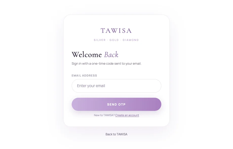
You sign in with a one-time code sent to your phone or email, or with Google. The code screen counts down before you can resend, and lets you fix a wrong number without starting over.
The account keeps three things in one place: your details, your orders filtered by status with Track and Buy Again, and your saved addresses.
Five steps,
shop to doorstep.
- DiscoverStart from who it’s for, or a metal.
- NarrowFilter by category, metal and price.
- ChoosePick the metal, stone and colour.
- SaveWishlist it, or add it to the bag.
- BuySign in with a code and pay online.
days of design, from the logo to every screen on desktop and phone. The build is still in progress.